Tuesday, April 7

Here is April's sketch...sorry it is a bit late.


The simplicity of this sketch is what makes it great. Look at how much room there is for your imagination and creativity to take wing. What will you do with it?
Sunday, March 1


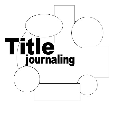
Here is March's sketch. First, notice there is not square outline around the layout...just pretend there is...my bad...LOL. I plan to use this one as a yearly record. The title is going to be: "2008: the year that changed my life." I will use the different blocks around the circle to record the events of certain months such as the month we got married, and the month we found out we were pregnant with Gunnar and so on. Also the shapes around the circle are just squares and circles but experiment with different shapes such as hearts or stars. I challenge you to do this layout with out photos, instead focus on journaling. See what you can do with it.

Wednesday, January 14

Here is the first sketch for this year. Sorry it is so late...for obvious reasons I have been a bit busy. I designed this layout for Gunnar's first six months and I will post something when I get it done. Use the tags for journaling or photos or mix and match. It is a two page layout and try to experiment with making the downward facing tags interactive...make them pull out or open up, you are bound only by your imagination.

Tuesday, December 2


Here is the final sketch of the year. I did this layout in probably March of 2007 when Alycia was about six months pregnant with Terrance. Isn't she cute? The chipboard elements are designed, and painted by me and totally original. I used bright colors and contrasted them with some light neutrals to make them pop. One of my favorite parts of this layout is having the title run over onto the photo. I also loved developing and making the elements for this layout. You should definitely try this at home.
*look at how long her hair is...I can't believe she cut it...I wish my hair was that long*

Tuesday, November 4


Here is the sketch for November! I love the vertical and horizontal lines and how the section up the layout. Pair the design with craft paper background and bright, bold, patterned paper sections and embellishments and you will love the results.

Friday, October 3


Here is Octobers sketch. I did this layout quite a while ago and when I revisited my layouts and saw it again I wanted to share it all with you. I love the contrasting colors, the involvement, but also it's simplicity in design. Try it out and see what you come up with.

Friday, September 5

Here is the latestest sketch. Don't you just love the linear feel to the layout. Don't be afraid to add embelishements where some of the photos would go or matte some of the pictures. Remember...a sketch is just an idea...a starting your creativity, so let it run wild and see what you can come up with.